Website
How to build a bridal portfolio website that books clients
Mandy at PrettyPilotJune 17, 20269 min read
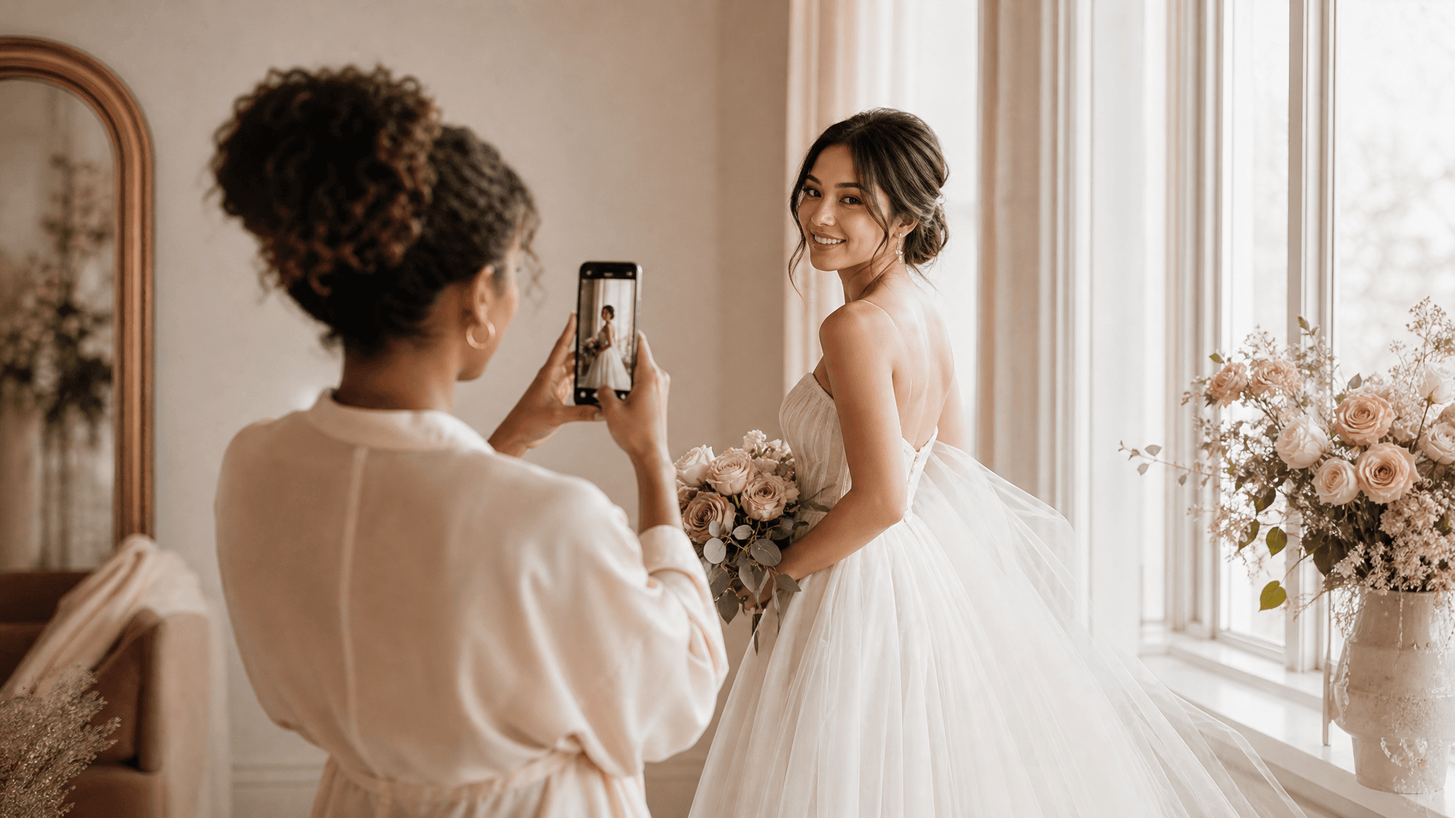
You can have the prettiest Instagram grid in your city and still wonder where the bookings went.
I know because I lived it. My feed looked great. My DMs were full of "obsessed!" and heart emojis. And my calendar had gaps a bride could drive a limo through.
Here's the thing nobody tells you when you're building a bridal beauty business on social. That grid isn't yours. The platform owns it. The algorithm decides who sees it. And when a bride finally finds you, she's trying to read your prices, your service area, and your vibe through a square photo and a caption. She can't. So she keeps scrolling.
A real website fixes that. Not a thin booking link with your name slapped on top. An actual site, built to do one job: take a bride who's curious and turn her into a bride who's reaching out.
Let me walk you through how to build that, page by page.
why a grid can't close a bride
A bride planning her wedding is doing research, not casual browsing. She's got a Pinterest board, a budget her mom keeps asking about, and maybe six artists open in tabs. She's comparing.
On Instagram, she can't compare you well. She can't scan your pricing. She can't tell if you travel to her venue. She can't find your availability without sending a DM and waiting, and a lot of brides won't send that DM. They just move on. I wrote a whole piece on this called why brides ghost after the inquiry, because the ghosting usually starts before the inquiry ever happens.
A website lets her answer her own questions on her own time, at 11pm in bed, which is when most brides are actually planning. Make it easy for her to say yes and a lot more of them will.
the pages your booking site actually needs
You don't need twenty pages. You need six, each doing a clear job. Build these in order.
1. a home page that orients her in five seconds
When a bride lands on your home page, she's silently asking three questions: who are you, where do you work, and what do I do next. Answer all three above the fold, before she scrolls.
That means:
- A clear line that says what you do and who for. Something like "Bridal hair and makeup for [your city] weddings." No mystery.
- Your service area, named. Brides searching for an artist are searching by place. If you serve Napa, the wine country, and the Bay Area, say so.
- One obvious button. "Check my date" or "Start your inquiry." Not five buttons. One.
A hero image of your real work behind that, and you've already done more than most artists ever do. Don't overthink the home page. Its job is to point, not to tell your life story.
2. a portfolio that's curated, not dumped
This is where most artists go wrong. They upload every photo they've ever taken and call it a gallery. A bride doesn't want your archive. She wants to see herself.
So organize it. Group your work so she can find her version of pretty fast:
- By look: soft glam, natural, bold, editorial.
- By skin tone. This one matters more than people admit. A bride with deep skin wants to see you've done beautiful work on deep skin. Show her.
- By style: romantic, modern, boho, classic.
Pick your strongest images, not your most recent. Twelve incredible photos beat sixty good ones. If a shot doesn't make a bride stop and think "that, I want that," cut it.
And keep it honest. Show real brides, real weddings, real faces. We'll talk about the line you can't cross in a minute.
3. a services and pricing page that lets her self-qualify
I'll say the unpopular thing: put prices on your site. At least "starting at."
Brides qualify themselves on budget before they ever reach out. If you hide your pricing, the bride who could afford you and the bride who can't both have to DM you to find out, and the one who can't is wasting both your time. The one who can sometimes assumes you're out of her range and never asks.
A "bridal makeup starting at $X" and "bridal party, per person, starting at $Y" does the filtering for you. You'll get fewer inquiries and more of them will be real. That's the trade you want.
List what's included too. Trial, day-of, touch-up kit, travel. Brides are comparing apples to apples, so make your apple easy to see.
4. an about page that builds trust
A bride is inviting you into one of the most photographed, most emotional mornings of her life. She wants to know who you are before she does that.
Your about page is where you become a person, not a logo. Tell her:
- How long you've been doing this and how you got into bridal.
- What working with you actually feels like. Calm? Fun? Early-morning-but-worth-it?
- A real photo of you. Not a stock model. You.
Keep it warm and short. She's not reading a memoir. She's deciding if she'd feel comfortable with you three inches from her face at 6am on her wedding day.
5. a contact and booking page with ONE call to action
Here's a rule I'd tattoo on every beauty pro if I could: one primary call to action. Pick the single action you most want a bride to take and make it the easiest thing on the page.
If you use a booking tool, send her straight there. If you take inquiries by form, keep the form short. Name, date, venue or city, email, a line for "tell me about your day." That's it. Every extra field loses people.
This is the other piece a real website gives you. It layers right on top of the booking tool you already use, whether that's GlossGenius, Vagaro, or Square. The site does the convincing. Your booking tool does the scheduling. They work together instead of you trying to make Instagram do both.
6. the proof that actually converts
Two things turn a maybe into a booking: honest before-and-afters and real client words.
Before-and-afters work because brides want to see the transformation, not just a finished face. They want to know you can take a normal morning and make it wedding-ready. Show that. Same lighting, same crop, real bride.
Reviews work because a stranger's word carries more weight than yours. Pull a few of your best and put them where a bride will see them, on the portfolio page and near your call to action.
Get those reviews the right way: by link. Send happy brides a direct link to leave a review after their wedding. Never write reviews for people, never offer to "help" with the wording, never trade anything for a five-star. Link only. That keeps you clean and it keeps the reviews believable, which is the whole point.
the honest line on photos (read this twice)
I'm going to be direct because this is the part that gets people in trouble.
Your portfolio has to show real work. AI can help you make a real photo look its best. It can clean up the lighting, tighten a crop, calm a busy background. That's fine, the same way a good photographer edits.
What you cannot do is fabricate. You can't invent a before-and-after that didn't happen. You can't generate a "client" who doesn't exist. You can't manufacture a result you didn't produce. The FTC treats that as a deceptive claim, and beyond the legal side, a bride can feel when something's fake.
The rule is simple: enhance, never fabricate. A real bride, in a real chair, on a real day, shown at her best. That's the bar. Hold it and your portfolio becomes something a competitor's invented gallery can never be, which is true.
the technical must-haves, in plain english
You don't need to understand code. You do need your site to do three things.
Mobile first. Brides browse on their phones, almost always. If your site looks broken or loads slow on a phone, you've lost her before she sees a single photo. Your site has to look great on a small screen first and a laptop second.
Fast load. People leave slow pages. A bride won't wait four seconds for your gallery to appear; she'll bounce. Compress your images, keep it light, and don't pile on heavy plugins.
Basic on-page SEO. This is how brides who aren't already following you find you on Google. The right page titles, a clear description of each service, your city named in the right places, photos labeled properly. It's not magic, it's housekeeping, and it's how "bridal makeup artist near me" turns into a stranger on your contact page. I broke the whole thing down in local SEO for beauty pros, so start there if SEO feels like a foreign language.
Get these three right and your site stops being a brochure and starts being a source of new brides.
your launch checklist
Before you call it live, run down this list. If you can check every box, you've got a site that books, not just a site that looks pretty.
- Home page answers who, where, and what's next above the fold
- One clear primary button, repeated, never competing with five others
- Service area and city named in plain words
- Portfolio curated to your strongest 10 to 15 images
- Work grouped by look, skin tone, and style so a bride sees herself
- Pricing shown, at least "starting at," with what's included
- About page with your story and a real photo of you
- Contact or booking with a short form or a direct link to your booking tool
- Honest before-and-afters, real brides, enhanced never fabricated
- Reviews pulled in, gathered by link only
- Looks great and loads fast on a phone
- Page titles, descriptions, and city set up for Google
- Every link works and goes where it should
Run that list, fix what's missing, then publish. Done beats perfect, and a live site that books beats a beautiful draft sitting in your notes app.
If building all this sounds like one more thing on a plate that's already full, that's the part we handle. PrettyPilot builds and maintains exactly this kind of site for a flat fee, starting with Spark, and it layers on top of the booking tool you already use. You keep painting faces. We keep the site working.
Want to see what yours could look like? Grab a free strategy call at prettypilot.com and let's map it out.
Rather not do all this yourself?
That is the whole point of PrettyPilot. We run your website, local search, social, and reviews for you. Flat monthly fee, no contracts, and you keep 100% of every client.
Start freeYou make them pretty. PrettyPilot flies the rest.